Cornolti

The challenge
The challenge was to renew Cornolti's image, a historic gastronomy and an authentic institution in the Bergamo landscape of flavors, based on a story of family, sacrifice and passion. The goal was to create a visual identity that could tell about this heritage of tradition and quality with a contemporary, elegant and distinctive language, capable of attracting both loyal customers and a new audience.

The solution
In close collaboration with the strategic vision and project management of Runelab, our team has launched a complete rebranding process, aimed at enhancing the uniqueness of Cornolti. We have taken care of every creative and development aspect:
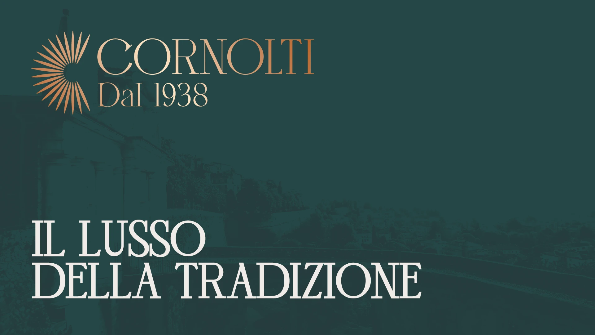
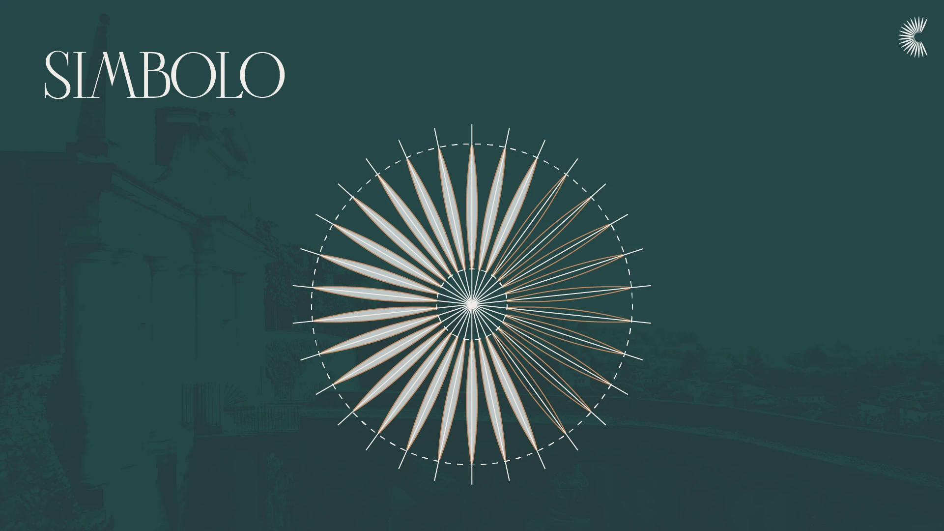
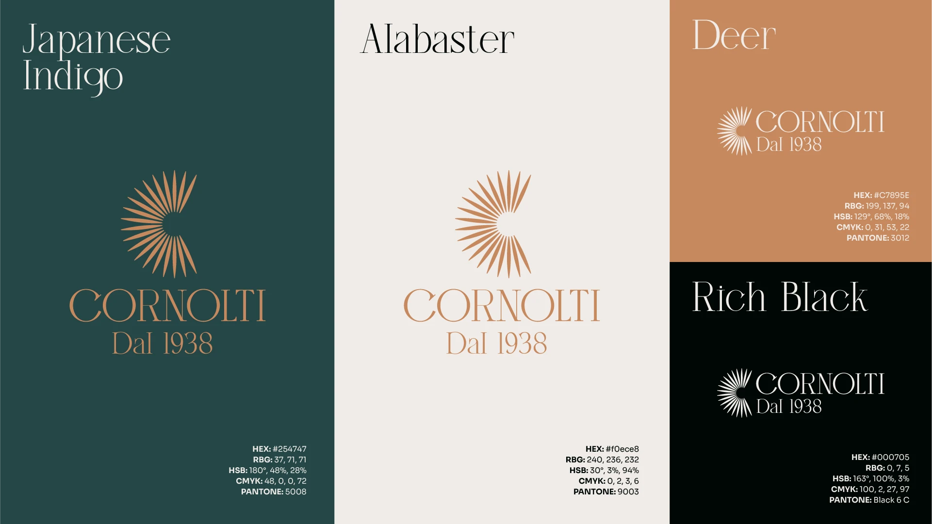
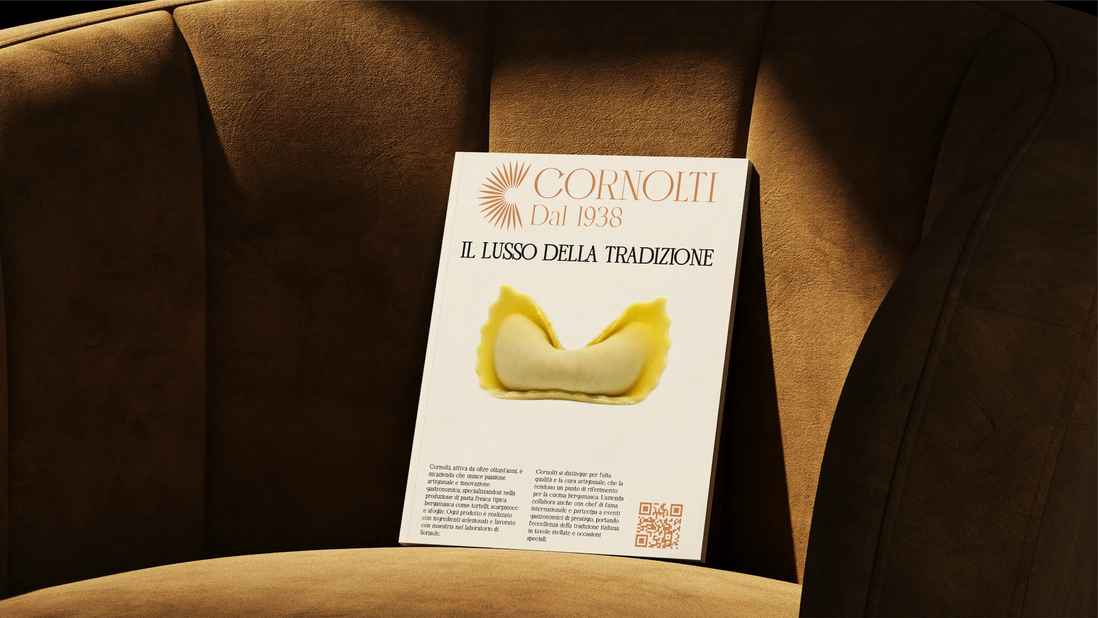
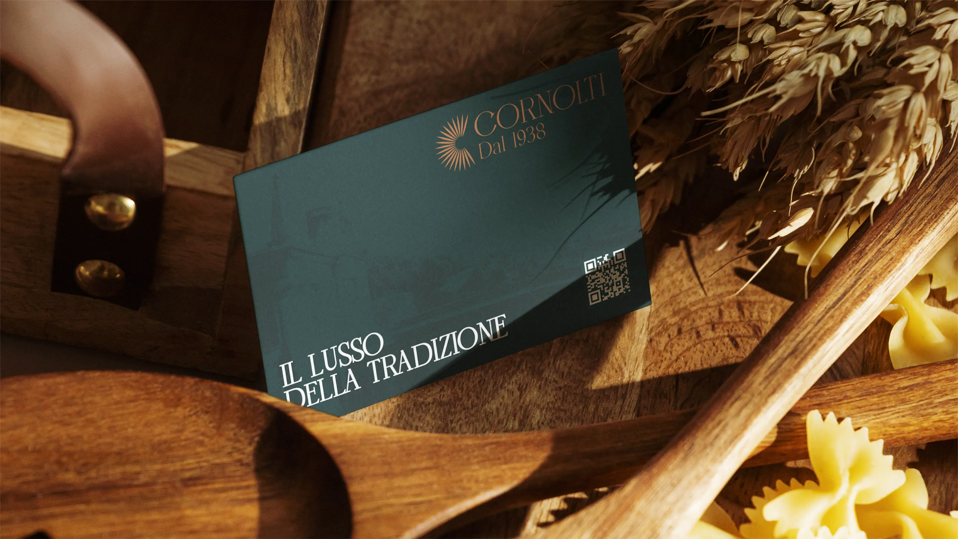
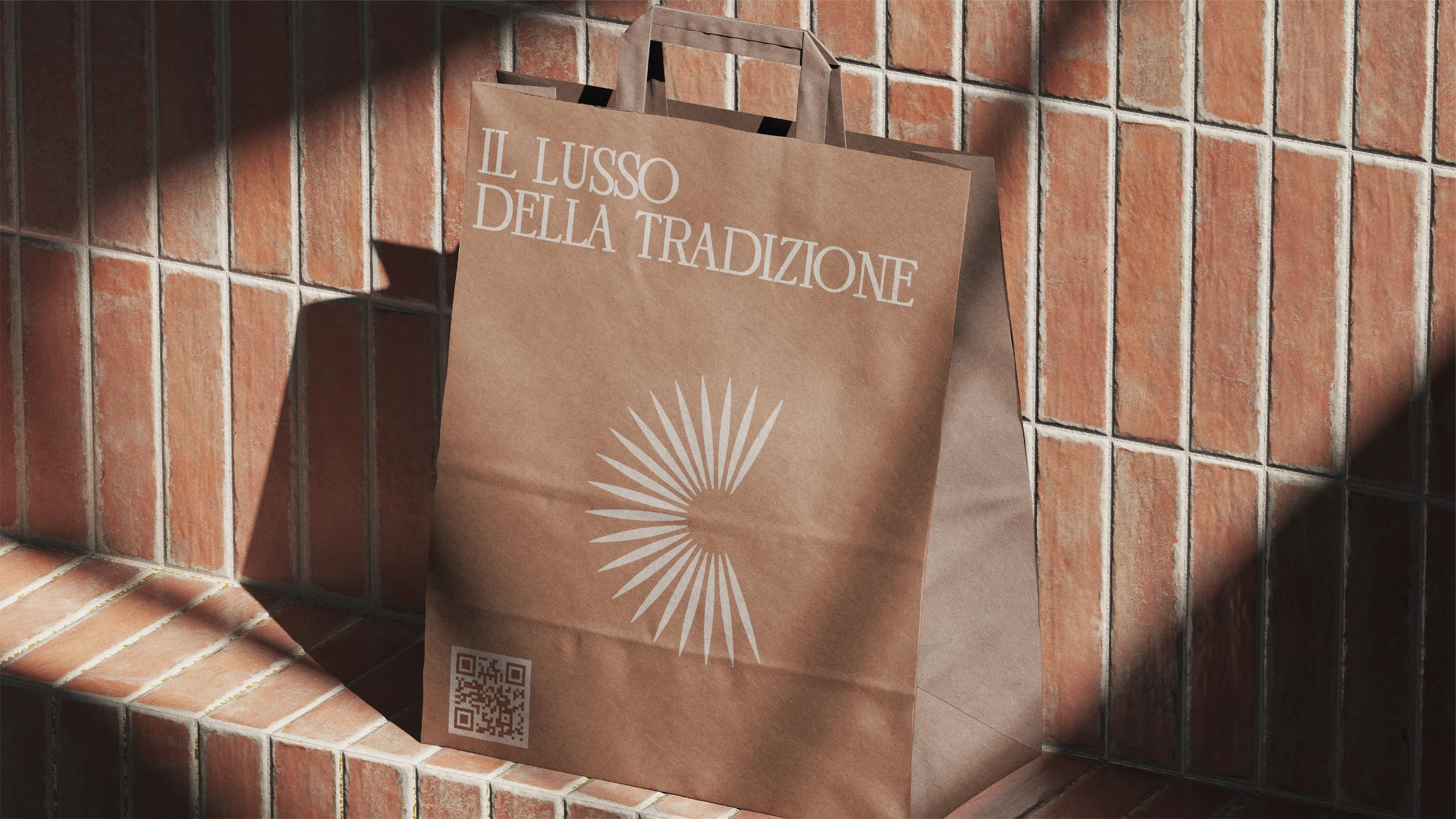
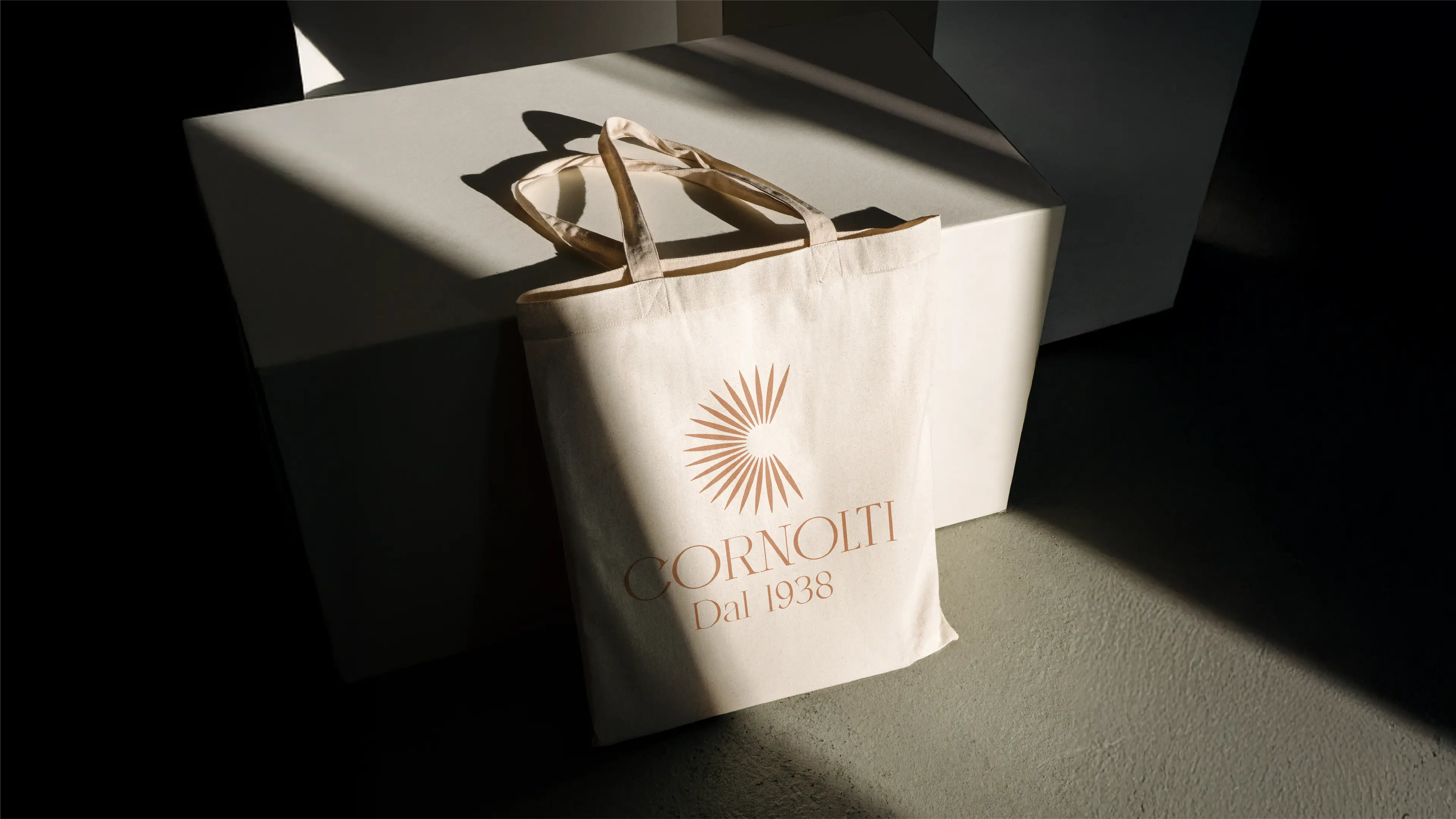
Logo Design: We have developed a new logo that combines elegance and tradition, a symbol that tells the story of the family and the artisanal quality of its products.
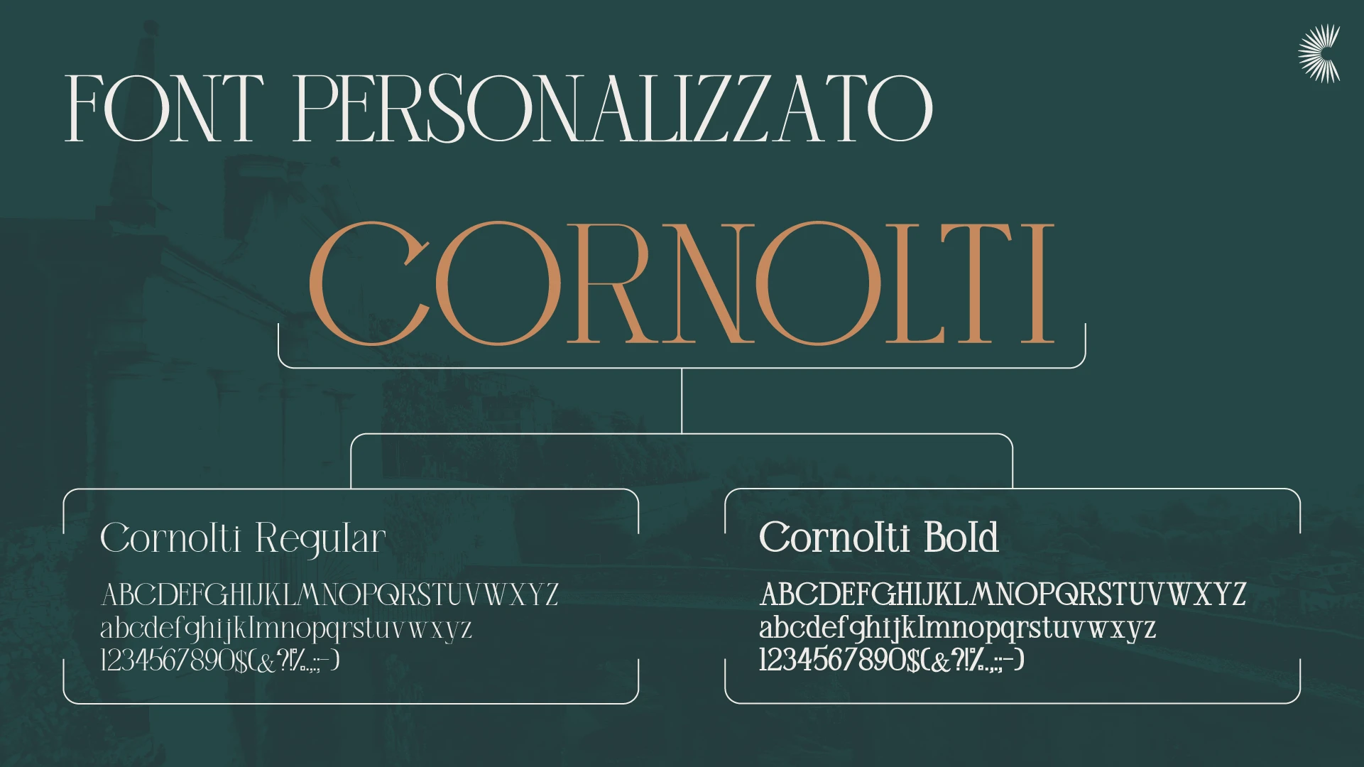
Visual Identity: We have defined a warm and refined color palette and a custom typeface designed from scratch, tailor-made to express the union between the solidity of tradition and a modern approach. The goal was to create a coordinated image that spoke of taste and attention to detail.
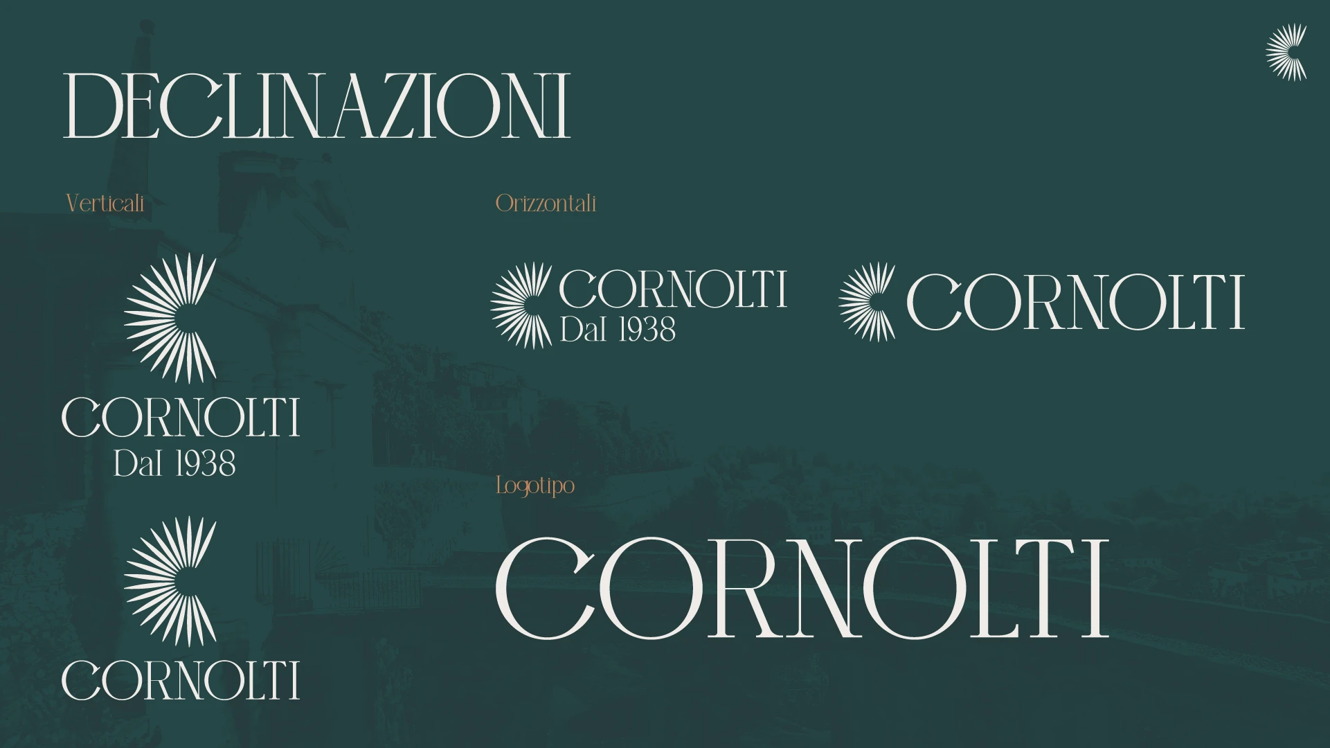
Brand Manual: We have collected all the new guidelines in a brand manual, a strategic tool to ensure that every communication, from packaging to digital channels, was consistent with the brand's new premium and authentic identity.

The result
Thanks to this synergy, Cornolti now has a strong, elegant brand identity faithful to its history. The rebranding has made it possible to enhance its position as gastronomic excellence, effectively communicating the passion and quality that have always distinguished the Cornolti family.